Here is a pic which shows some of the design thought that went into the reverse of the Ploughman One Pound note.
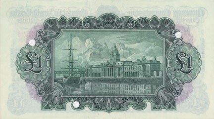
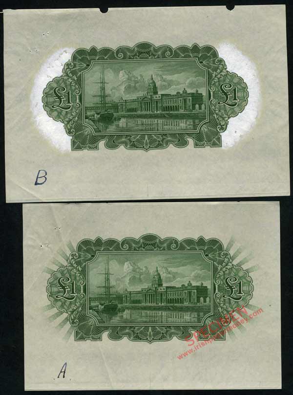
The rays coming out from the edges of the note are reminiscent of the design on the reverse of the 1922–1928 Bank of Ireland £1 note.
The upper version with the rays omitted was the design decided upon.
The pair show the thought process involved.
Ploughman Pound note
Unusual Ploughman Pound note proof
- Mac
- Taoiseach • Admin
- Posts: 1948
- Joined: 23 Jan 2015 15:05
Re: Unusual Ploughman Pound note proof
For comparison, the final design.
One Pound Ploughman reverse
- ThePloughman
- UNC
- Posts: 276
- Joined: 04 Nov 2016 16:37
Re: Unusual Ploughman Pound note proof
They made the right decision. The rays dont work, imo.
Btw, are the rays text, like on the bank of Ireland notes?
- Mac
- Taoiseach • Admin
- Posts: 1948
- Joined: 23 Jan 2015 15:05
Re: Unusual Ploughman Pound note proof
The rays are text.
The text reads as follows: top left, ‘PUNT•PUNT•’ repeated; top right, ‘ONE POUND • ONE POUND’ repeated; bottom left, ‘ONE POUND • ONE POUND’ repeated; bottom right, ‘PUNT•PUNT•’ repeated.